Project archive
pd-components
Unstyled, accessible navigation components for any Shopify theme, or any website.
- My role
- Creator and main author, 29 of its first 35 commits
- When
- August 2026 — present, at Prosper Digital
- Original
- pd-components.vercel.app
- Archived
A copy kept here in case the original moves, goes offline, or I lose access to it.
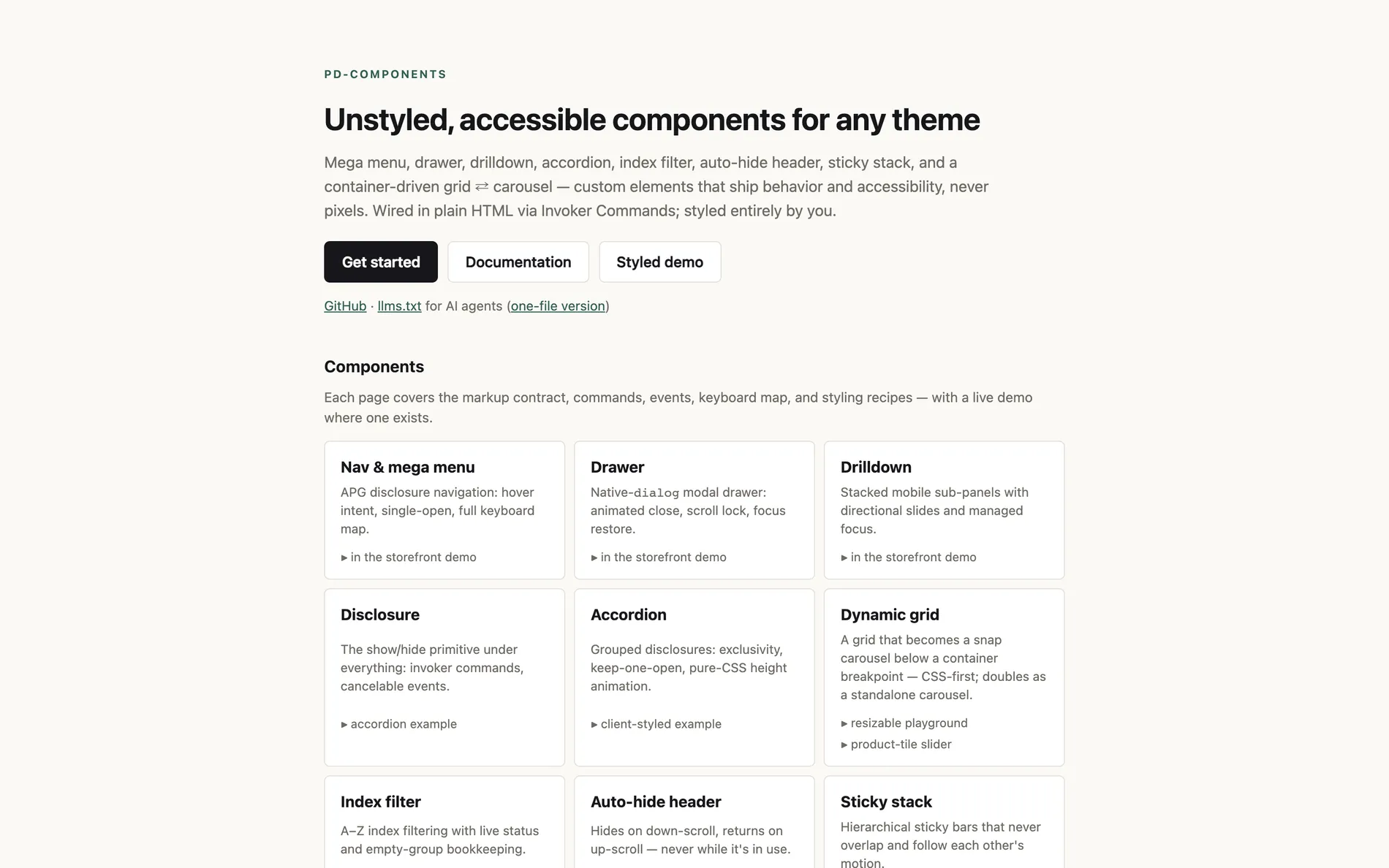
Every Shopify theme rebuilds the same navigation: a mega menu, a mobile drawer, drill-down panels, accordions. Most rebuild it with gaps in keyboard support and focus handling. pd-components ships that behaviour once, as custom elements that handle state, ARIA and focus, and leave every pixel to the theme.
What's in it
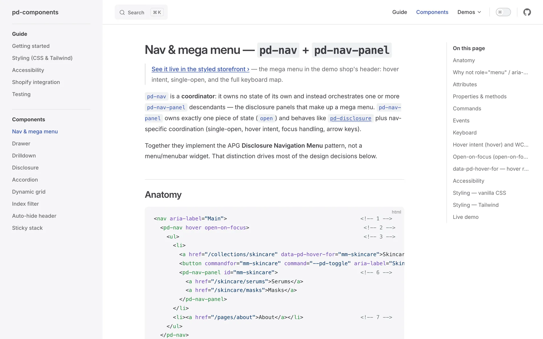
- Nav and mega menu: disclosure navigation with hover intent, one panel open at a time, and a full keyboard map.
- Drawer: a modal drawer on the native
dialogelement, with scroll lock and focus restore. - Drilldown: stacked mobile sub-panels with managed focus.
- Disclosure and accordion: the show/hide primitive under everything, and grouped panels with pure-CSS height animation.
- Index filter, auto-hide header and sticky stack: A–Z filtering, a header that hides on scroll down, and sticky bars that never overlap.
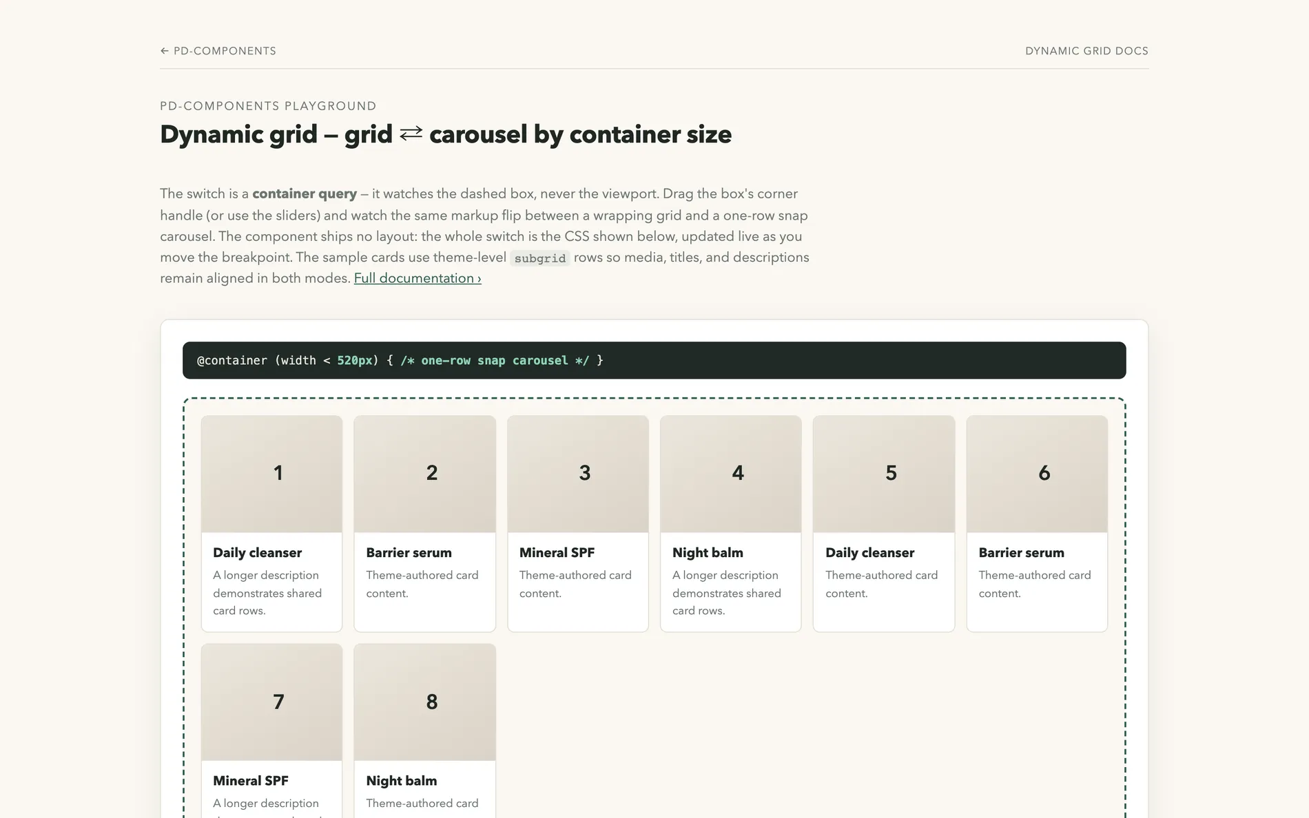
- Dynamic grid: a grid that becomes a snap carousel when its container gets narrow, driven by a container query rather than the viewport.
Principles
- Unstyled. Components toggle
open,data-state,inertandaria-*, never colours or layout. Themes style them with Tailwind or plain CSS. - Wired in HTML. Buttons open and close panels through the Invoker Commands API (
commandforandcommand), polyfilled where browsers lack it, with a JavaScript API underneath. - WCAG 2.2 AA first. Each component follows its ARIA Authoring Practices pattern, with full keyboard maps, managed focus and hover panels that meet success criterion 1.4.13.
- No platform code. There's no Shopify or Liquid code in the library; a guide covers the Shopify integration.
Every component page documents its markup contract, commands, events, keyboard map and styling recipes. The site also publishes an llms.txt so AI agents can use the library correctly.
How it ships
The library isn't published to npm. Prosper's theme pipeline vendors it into a theme with one command, copying only the component sets that theme uses; plain themes get a self-contained bundle instead. Unit and accessibility tests run in Vitest with axe, and Playwright covers hover intent, focus traps and animations in a real browser.